
Spotify Redesign: Podcasts
Background
As someone with a long commute and lots of curiosity, I have been very grateful for Spotify’s foray into podcasts. They recently redesigned their app to highlight podcasts in each user’s library. However, the Spotify podcast experience has lots of room for improvement. In this design challenge I hoped to address some of its key pitfalls, particularly with how one discovers and learns about new podcasts.
Because Spotify’s design changes towards podcasts have come primarily through their mobile app, I decided to focus on Spotify’s iOS experience.
This redesign was completed as an 8-hour design challenge in August 2019.
User perspectives on Spotify’s podcast experience
Before evaluating the podcast experience for myself, I conducted 2 user interviews to remove my initial biases and get a sense of what a Spotify podcast listener’s experience was like. My interviewees, Beau and Danielle, are two working professionals in their early 20s who actively use Spotify to listen to podcasts.
The main takeaways of my interviews were:
People perceive high barrier of entry to listen to new podcasts as each episode is a significant time commitment
People rely on social context - reviews, popularity, if friends or like-minded people listen - to evaluate whether a podcast is worth listening to
People want a curated experience that feels personal

When it comes to music, Spotify provides a great experience in discovering new, relevant artists and songs. This is Spotify’s core utility: facilitating the discovery of new content. However, my interviews showed me that Spotify users are unable to discover new podcasts because Spotify does not give them the information that they use to evaluate whether a podcast is worth listening to.
Evaluating the podcast experience
I investigated this problem statement by evaluating the experience of how one might discover a new podcast on the platform:


If users attempt to find new podcasts by selecting individual categories, they are met with little to no information about what a podcast is about or what makes it worth listening to. Through the alternate route of curated playlists, users encounter needless friction in navigating to pages where they can find more information about a show or episode.
Spotify’s experience and design encourages users to listen to podcasts before learning more about them. While this mode of discovery works with music, my research told me that podcast listeners have a different mental model when looking for a new podcast. When looking for new podcasts, people seek context and information to make a considered choice.
This led me to my guiding how-might-we statement for my redesign: how might we make podcast listeners feel confident about a new show without listening to an episode?
Ideation and Definition
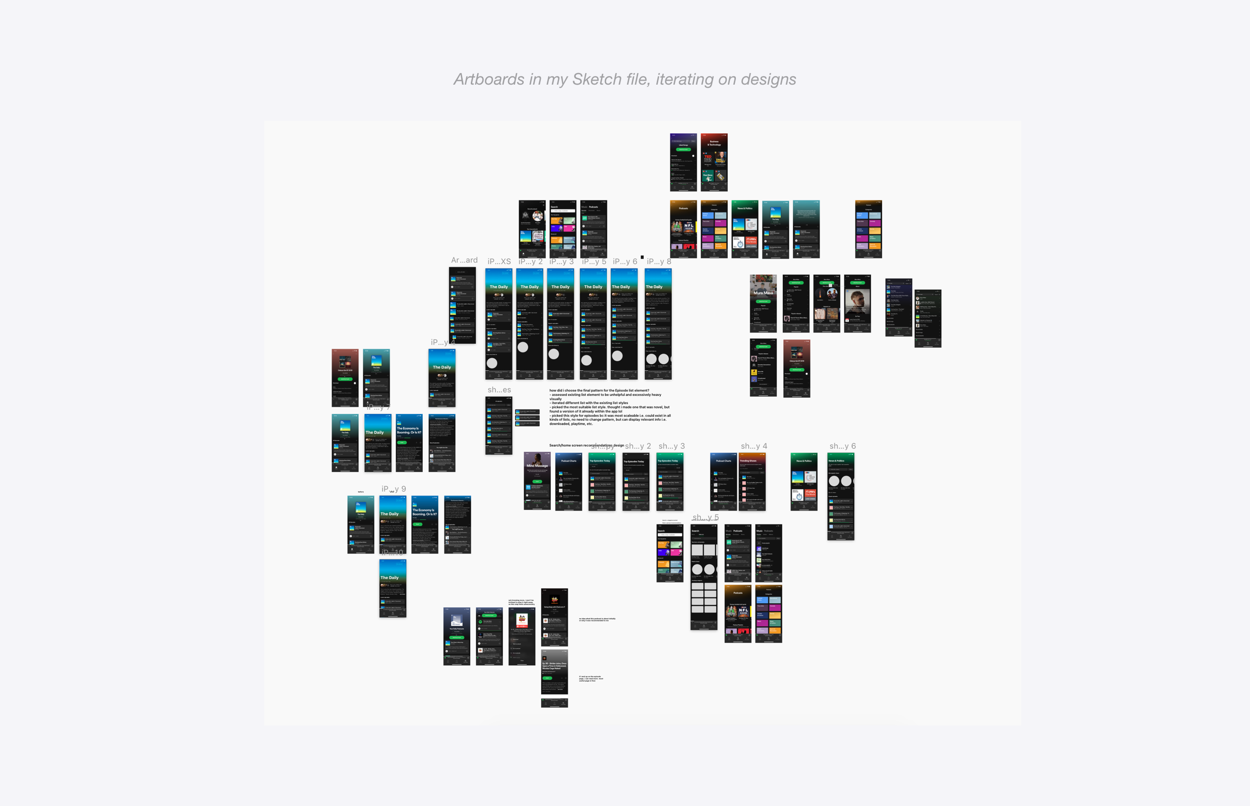
I quickly sketched out some concepts and mapped out potential new users flows. Quickly putting out concepts helped me identify the areas I wanted to focus my redesign on. While I typically would spend more time iterating and prototyping in lower fidelity, I decided to move to higher fidelity early in the design process as I felt I could iterate faster by using Spotify’s existing design language.
For my redesign, I decided to focus on helping users learn more about shows and episodes. To do so, I redesigned the main touchpoints of Spotify’s current podcast discovery experience:
The search page, where users start the podcast discovery process
The category and playlist pages, where users see individual episodes or shows
The show and episode pages, where users learn more about a podcast
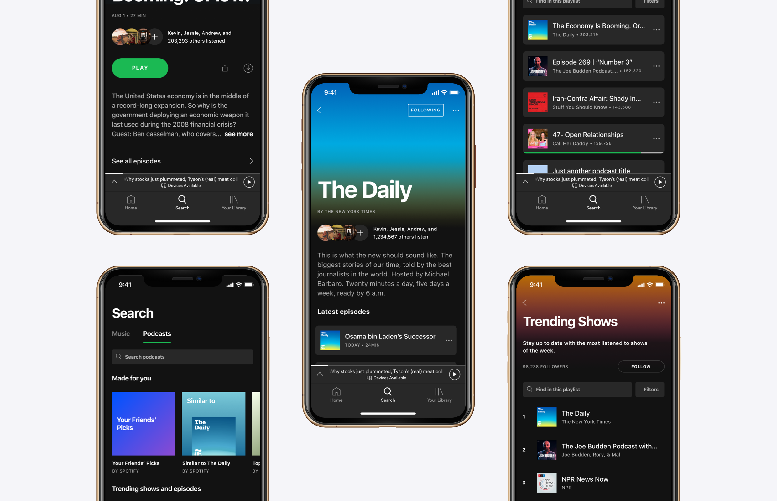
A search that embraces the unique podcast discovery experience
I looked at the podcast discovery as it starts from the search section of the Spotify app. For this screen, I wanted a design that surfaced relevant content to users in a way that better matched how listeners looked for podcasts.

In Spotify’s current design, users go through the same experience regardless of whether a user is searching for podcasts or music. However, my research showed me that the way people discovered and looked for new podcasts was not the same as the way they did for music. To better match this mental model, I redesigned the search page to include a section dedicated to the podcast search and discover experience.

To better surface more relevant content to podcast listeners, the new podcast search page emphasizes content that is curated to the listener. Playlists that are determined by a user’s listening history, what friends are listening to, and popular or trending podcasts and episodes, are more likely to be relevant than randomly displayed genres.

Rethinking playlists and categories to encourage discovery over listening
From the search screen, users will navigate to a playlist or category, where they can see individual podcast shows or episodes. I redesigned the playlist and category pages to encourage users to navigate to podcast show or episode pages where they could gather more information and make a more confident, considered choice.
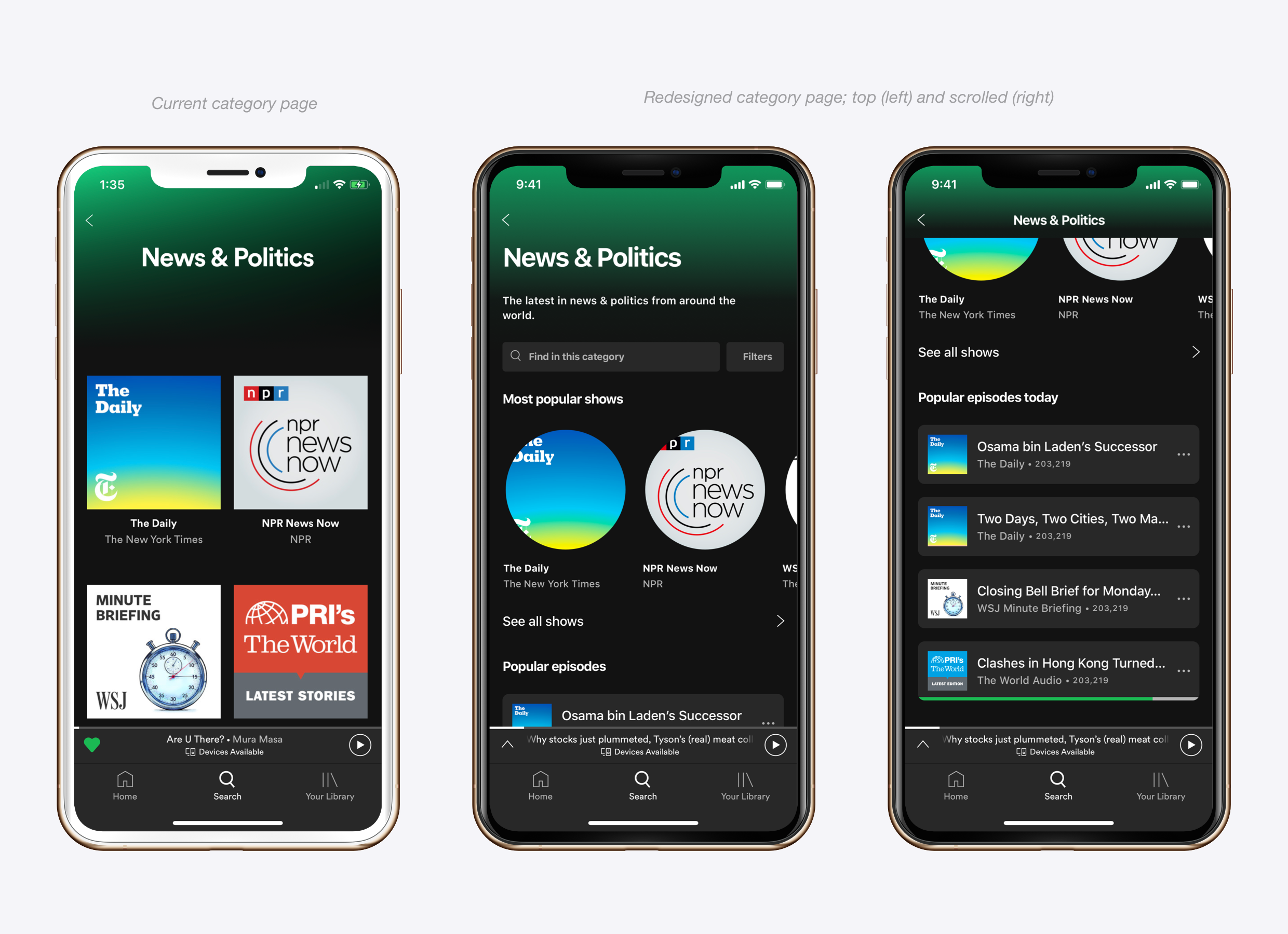
The current category page presents a long, unorganized list of individual podcast shows. I redesigned this screen to emphasize the most popular shows, giving users more information about which shows are worth checking out. Additionally, the redesign highlights popular episodes, giving users a faster entry point to trying out a new podcast.

With the large green “Play” call-to-action, and the play button on individual episode cards, the current version of the podcast playlist invites users to play episodes right away. From my research, user’s are not likely to listen to an unknown podcast right away. I redesigned the podcast playlist to encourage users to navigate further and learn more about individual episodes. By redesigning the episode list element, a user is able to see more episodes on the screen, and will have to tap through to learn more about the episode prior to listening.

Provide the contextual information about episodes and shows that enable decision-making
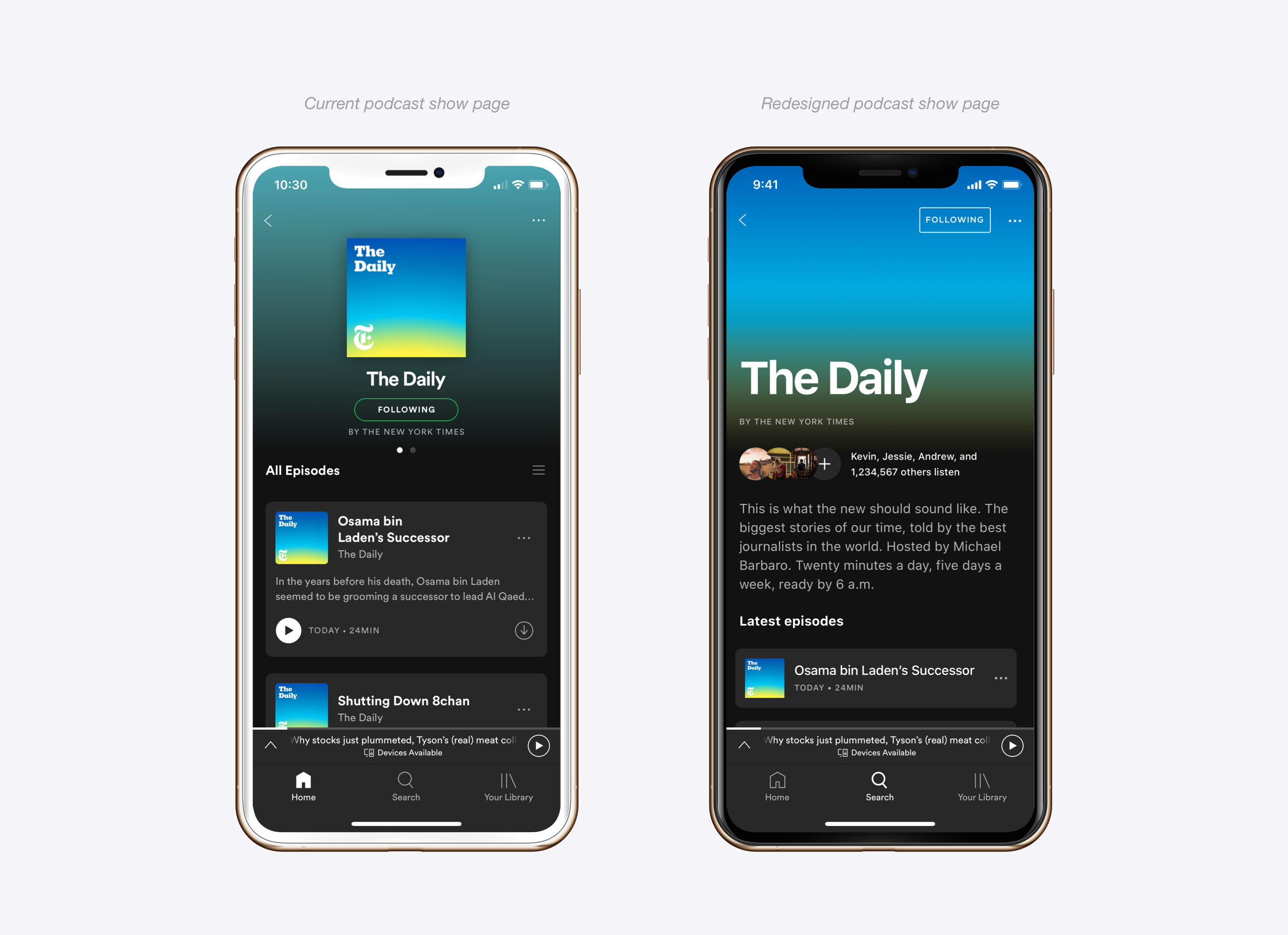
The redesigned podcast show screen provides significantly more context and information about the show than the current design. My redesign prioritizes social context so that users get a sense of the show’s popularity as well as if any of their friends listen to it. The show’s description is right at the top so that users can learn more about the show right away.

For regular listeners, the show’s most recent episodes are easily accessed right after the description, and a list of similar podcasts gives them an avenue to discover a new show. For new listeners, highlighting the popular episodes gives them a good starting point with the show.

Currently, the podcast episode screen is the most successful in providing information users find helpful. I redesigned the episode page to include social context (popularity and friends who listen) and introduce other patterns consistent with the rest of my redesign.
Design for consistency
As a Spotify user, I constantly notice the many inconsistencies that have arisen in Spotify’s design language as their product has evolved over the years. For example, newer screens have content that is left aligned, where older screens are center aligned. I took this redesign as an opportunity to introduce more consistency into the Spotify’s design language, addressing things such as type weight, size, alignment, and information hierarchy.

Closing remarks
When mapping out my redesigned flow, the screens that a user encounters are effectively the same as Spotify’s current design. However, improving each step in that discovery process creates an entirely new experience.
By acknowledging the podcast discovery process as unique, encouraging discovery and learning about a podcast over listening, providing the social context that listeners see as important, and adding a little consistency along the way, I feel like I have successfully redesigned Spotify’s podcast experience to better suit the needs of podcast listeners looking to discover new content.

I took some time to walk both Danielle and Beau through my redesign, and both responded positively, remarking that the changes would be encouraging to see if they were to be implemented into the actual app.
If I could take this project forward, I would love to get an actual prototype into more people’s hands, and test to see how the experience I designed compares to the current one, and where it can be improved.
——————————
This design challenge was a lot of fun for me. Working within an existing design language and focusing on a specific part of a product challenged me to think about how the design decisions I was making could potentially affect the product as a whole.
Admittedly, I spent as much time putting together this write-up as I did doing the actual design process of research, ideation, and design. One of the areas I want to grow in most as a designer is being able to effectively communicate my work, so I focused on that specifically in this project.
Thank you for reading!
