
FIBBAGE
As part of a design challenge for an avatar-based social platform, I designed the trivia word-game Fibbage for mobile.
The challenge was completed across 2 days.
design assumptions requirements
Assume users are accessing the game from a mobile social platform.
User avatars must be visible on-screen while in-game.
Users must be able to text-chat in-game.
beginning: initial sketching
To begin, I put pen to paper, thinking through a brief user persona, user journeys, flows, and initial wireframes.
All my sketches and working on paper can be seen in the gallery below:


A (Brief) User Persona
To begin designing, I thought through the user's context, motivations, mental model, and pain points as they would begin interacting with a mobile version of Fibbage. I dubbed this persona The Trivia Game Player. In constructing this user persona, I also thought closely about the social platform that they would be using in #me, and the users' probable desire to use the platform to connect and socialize with others:
Context: "I'm looking to play a fun trivia game with some friends."
Motivation: "I want to play a trivia game that allows me to be creative, expressive, and connect with other people."
Mental Model: "Trivia games are most fun when I can interact with other people. I love the back and forth between friends when we play games."
Pain Points: "I need to be able to play the game and talk with other players at the same time, otherwise I feel like I'm playing by myself."
Sketching Explorations
Within my sketches, I explored various user flows and wireframes of the user's interaction of a mobile version of Fibbage. Some ideas I explored were:
How the user might join others in playing the game
Various screen layouts that met the design requirements of being able to chat with others while in game and having avatars visible on screen
What happens after the game has ended
Some of my ideas, naturally, did not make it past the sketching stage. Everything that follows is how I landed at the final design mockups for a mobile version of Fibbage.
User journey + initial flows
From the user persona, I crafted a user journey that highlights the various stages of the user's experience, which extend beyond playing the game.
User Journey

What I wanted to emphasize in my design were the Join, Play, and Connect phases of the user journey. Existing on a social platform, I aimed to design Fibbage for a user who was looking to interact and develop connections with other players. In my design of Fibbage, friends old and new are given a space where they can joke around and express themselves.
In the Join phase, I wanted it to be as simple and intuitive as possible for users to begin playing the game, thinking through how the user would be able to play with friends he/she already has or find a new group of buddies to play with.
In the Play phase, I wanted to emphasize the design requirements of having avatars visible on screen, and having a chat feature that is accessible throughout gameplay. Most importantly, I worked to ensure that these requirements did not interfere with the actual gameplay itself, and instead enhanced a user's experience by allowing effective and simple interaction with others.
The Connect phase of the user journey underscores the importance of developing relationships within the social community that houses the game, and allows an avenue for users to establish relationships with someone they may have had positive interactions with while playing the game.
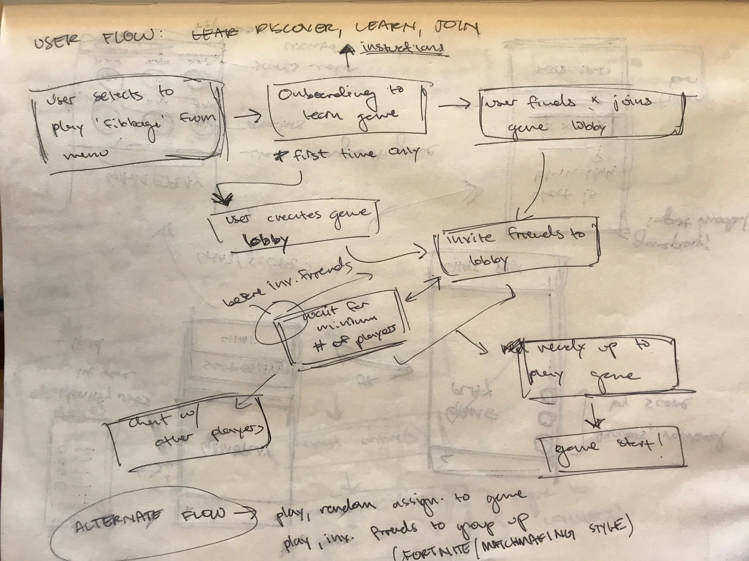
User Flow 1: Discover, Learn, Join

User Flow 2: Play, Connect

UI flows
From my user flows and wireframe sketches, I created UI Flows and mockups for the game.
UI Flow 1: Discover, Learn, Join

UI Flow 2: Play, Connect

mockup details + iterations
Game Lobby and Start

Previous iterations of the game lobby and starting countdown.
Previous iterations of the game lobby featured a different color palette and the use of 'cards' to signify each unique user. With the current color palette, white text is much more readable, removing the need for the 'cards' and cleaning up the screen.

From the game lobby, the user can begin playing by themselves or invite friends to play with them. After selecting that they are ready, the user(s) enter a queue that searches for other players (or groups of players). Once enough players are found (minimum of 3, maximum of 6), the game begins.
Having a game lobby where users can queue by themselves or in smaller groups to play the game removes the pressure from users to have a complete group to begin playing the game. Moreover, this style of finding games encourages users to meet new people and make new friends.
Gameplay

Previous iterations of the gameplay screens.
Gameplay screens are challenging because there is a lot of information and prompting of users necessary, and there isn't a lot of screen real estate. Previous iterations (left) explored how to indicate time remaining, and have enough visual clarity for users to read.
The newer version provides a better balance of prompting users with instructions, providing information with timing, and using a typeface and size that increases legibility.

Chatting within the game
For the user to develop and foster relationships with others while playing, in-game chat must be possible without interfering or distracting from gameplay. Chat bubbles emanating from user avatars removes the need for a dedicated chat box. The user is also still given the option to open a chat log to see what messages have been sent previously. Integrating a chat feature in this manner makes gameplay more exciting, and allows for casual banter and exchange between users.

Connecting with others after the game

To emphasize the importance of developing relationships with others, the user is prompted to add any friends they made while playing the game. This encourages the user to continue developing relationships with other users.
What's next?
The above work does not represent a complete or final design. There are a few things that I would like to continue exploring and iterating to move forward in this design:
Exploring different interactions and layouts for the "Play" phase of the journey. Currently, the gameplay screens resonate closely with other trivia mobile games. I would like to continue iterating on different layouts of in-game instructions, texts, prompts, avatars, and scores
Refining other phases of the user journey, namely the "Learn" and "Join" phases. The "Learn" and "Join" phases are what hooks beginning players to the game in the first place, and potential options and features need to be thoroughly explored. For the sake of this test's scope, I focused largely on the gameplay flow.
Moving forward, creating an effective "Learn" phase (i.e. onboarding process for the game), and thinking through how that may be incorporated to the overall user flow better, is something that would be essential to a user's first-time experience with the game.
The "Join" phase I found to be challenging in terms of interaction and layout, and trying to give the user just enough information they needed to begin playing the game with other people. If I were to continue designing, I would work on emphasizing the "Join" phase and ensuring that a user's experience is tailored to what they need to begin playing.
- Usability and user testing would help me get feedback on how my design is functioning, and whether or not the user's experience of the application is what I set out to achieve.